What Do I Wear to my Photoshoot..?
Everyone worries about what to wear in photos, especially if you aren't exactly a fashionista. Personally, I fall into this category myself. My idea of dressing up tends to be putting on pants and some mascara. If I'm not lounging in my sweats or yoga pants, you might be lucky to catch me in some jeans and an oversized shirt. Being a photographer, I've learned through trial and error what outfits work, and what outfits file for unemployment... metaphorically speaking. After all, you're investing good money into your photo sessions. You deserve to look like a million bucks.
If you’re unsure where to start after booking your photography session, look no further! Here are some tips to help elevate your outfits and make sure your photos look aesthetically pleasing. To start, lets simplify what makes an outfit visually appealing:
Fab!
We love to see it
DO
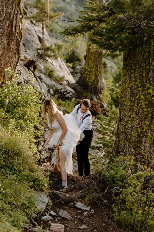
Wear neutral, earth-toned colors, and subtle, simple patterns. These best compliment the style of photography I provide, and who many photographers provide. (we'll touch base on how to work bold colors later) Wearing neutral colors draws the eye to you, and less on your clothes, which helps achieve an upscale, timeless look. These colors are fantastic for outdoor photography, or with neutral-background indoor sessions.
Busy...
And not in the productive way!
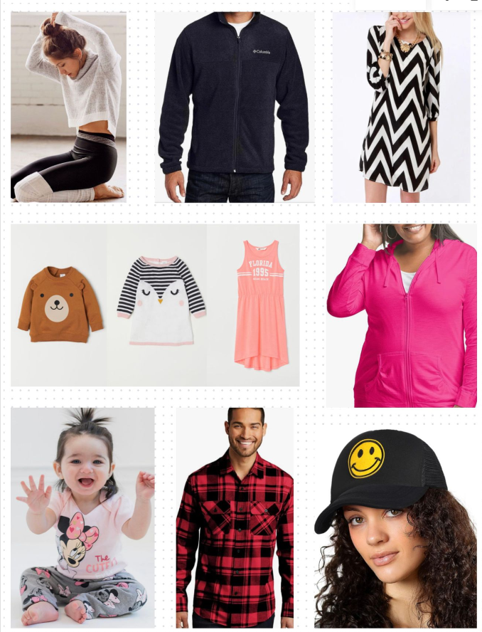
DON'T
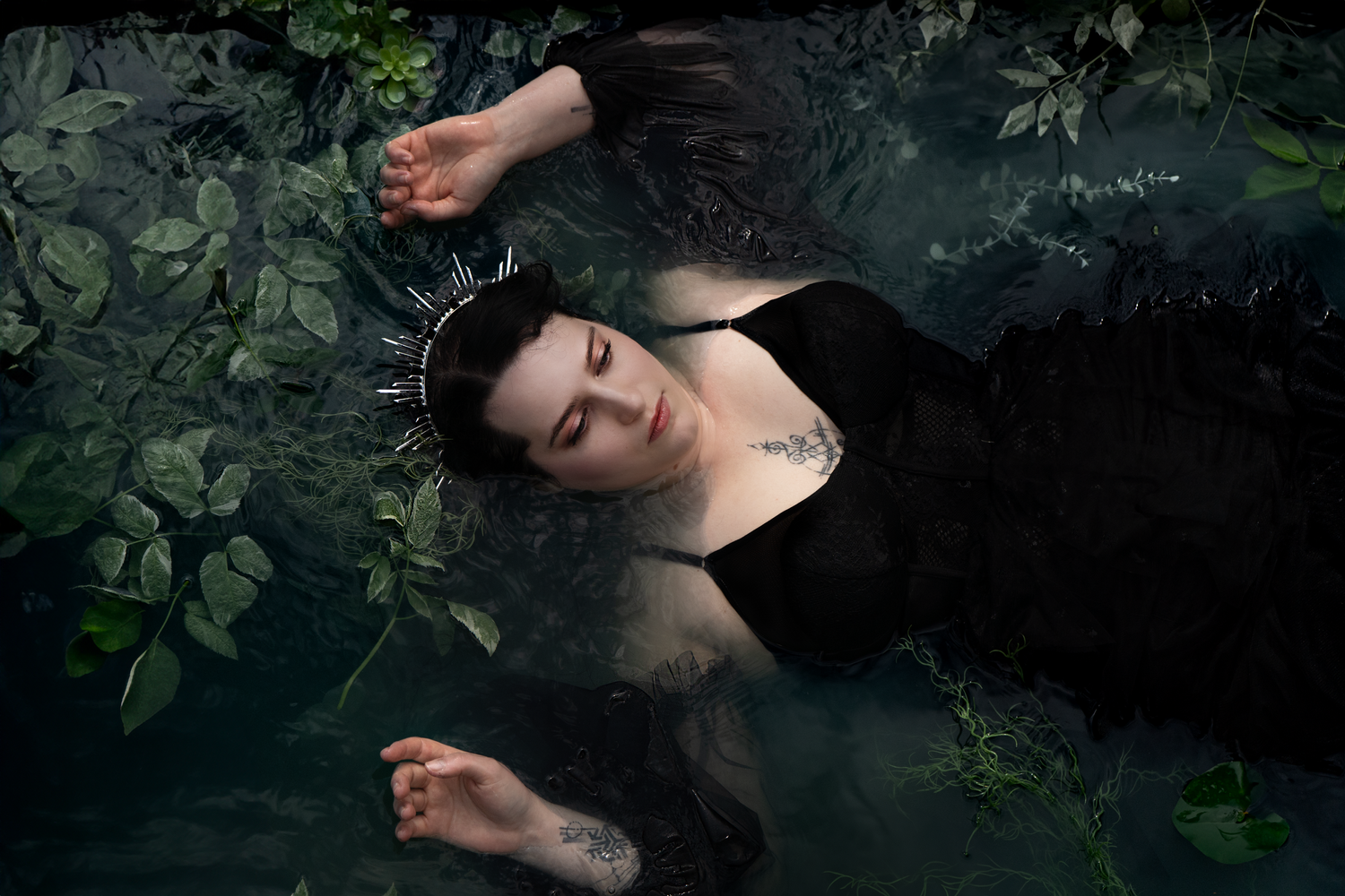
Wear bold patterns, logos, or brands. Crazy patterns and bright colors often make editing difficult. This can effect the outcome of the aesthetic, or cause your photos too look messy.
It’s also important to make sure your clothing does not have any logos, brands, or wording visible. This will take the attention away from you, drawing the eye to distracting words or illustrations.
Let's Elaborate...
Beyond the very basics, here are some additional tips you can use to start customizing your look.
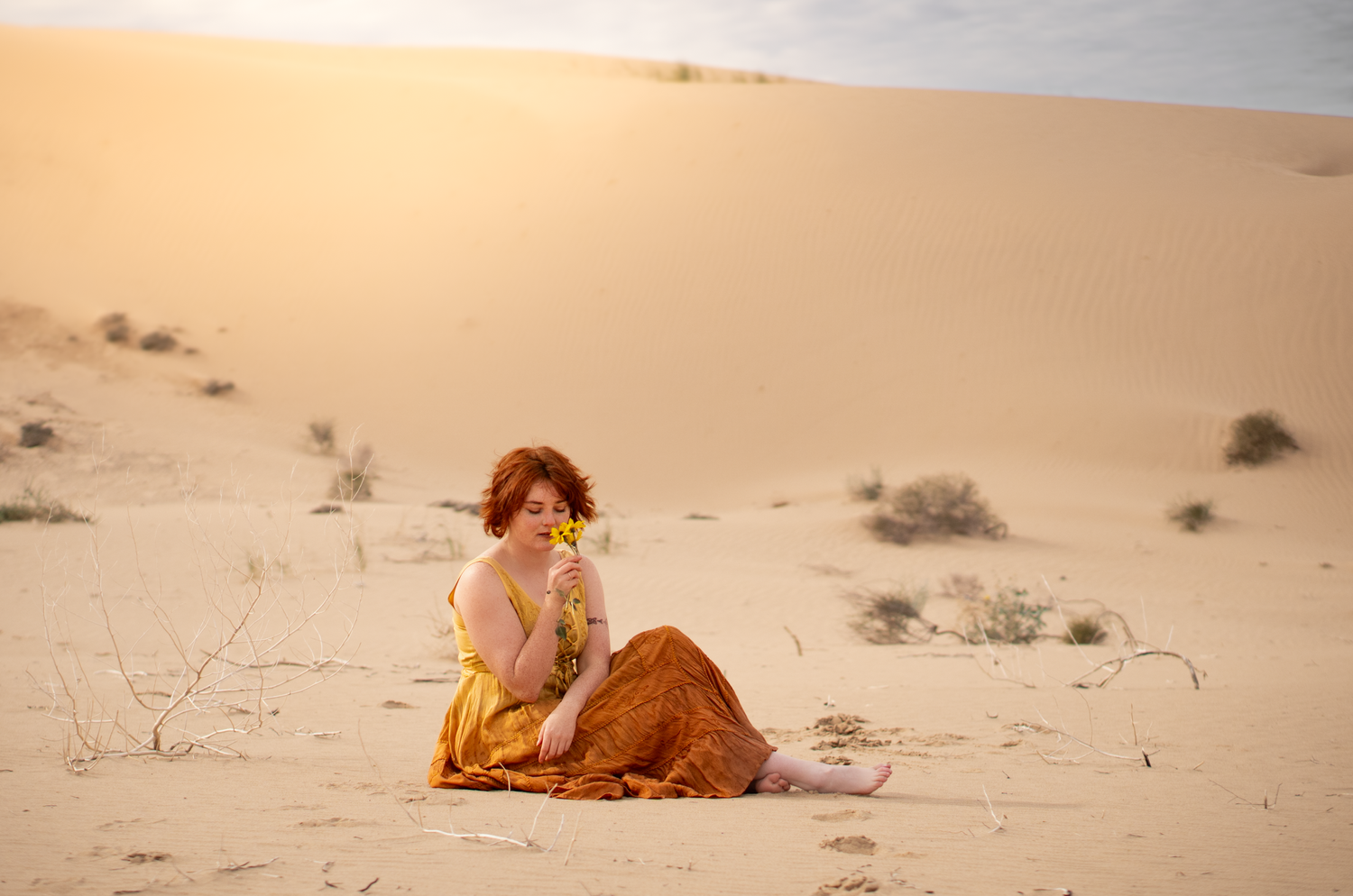
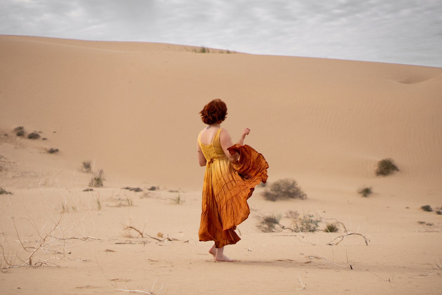
If you want an extra splash of color, chose 1-2 colors either on their own, or with some agreeable neutral colors to pull everything together! A splash of orange in the fall, blue in spring, or a small hint of red or green for Christmas always impresses. Study your environment and think of colors that would go well. Here we have a hot and sunny desert environment. We found natural yellow wildflowers in the area to use as an accessory. The gold and amber tones of the dress mirror the flowers and the russet hair of the model. It also accentuates the sense of a sunny, fiery desert.
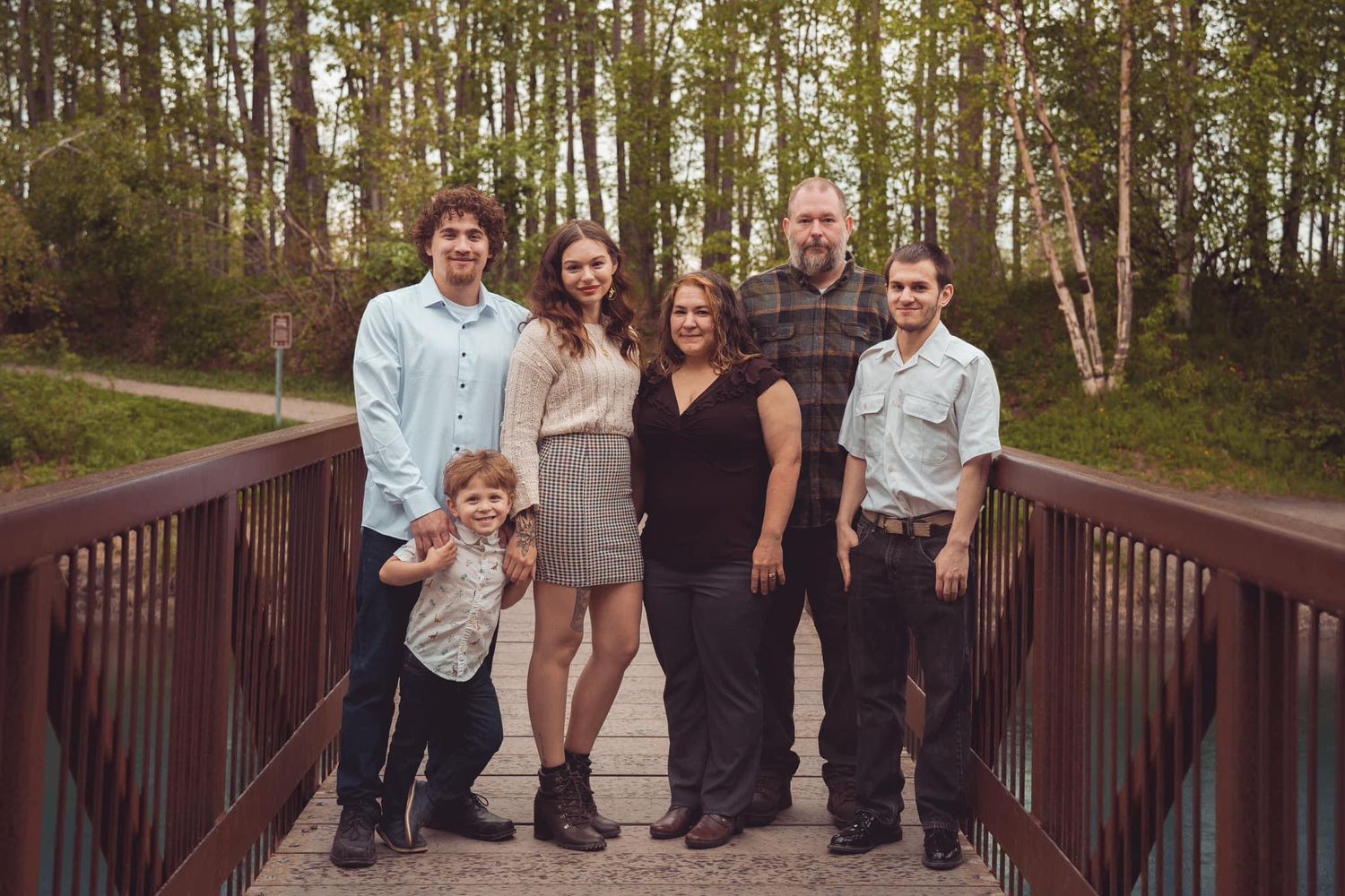
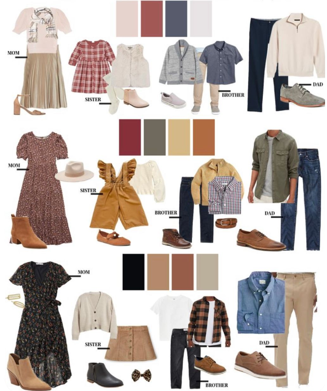
You can add soft, simple patterns, or patterns that compliment each other to your portraits! If you don’t consider yourself fashionably inclined, a good simple rule is to not put every person in the photo in a pattern (even if its matching!) In this example we have 3/6 of the subjects wearing patterns, and the other subjects wearing plain solid colors that compliment each other well. Notice how none of the patterns outshine the others, all of them are simple and muted. This Also gives dimension to the image as your eye is drawn to each individual subject, instead of everyone blending in together. Incorporating patterns in this way can create a more dynamic session. Just be careful when selecting fabrics, because patterns can also overpower an image and be distracting or unflattering.
Choosing a Palette
Choosing a palette is easier than you think! As a general rule, it's hard to go wrong with neutral colors. I recommend looking for inspiration on Pinterest for outfit ideas, but if you're still struggling with figuring which colors go well together- I have a fun solution that takes some of the guesswork out of it!

Palette Cheat Sheet:
a quick hack to get inspiration
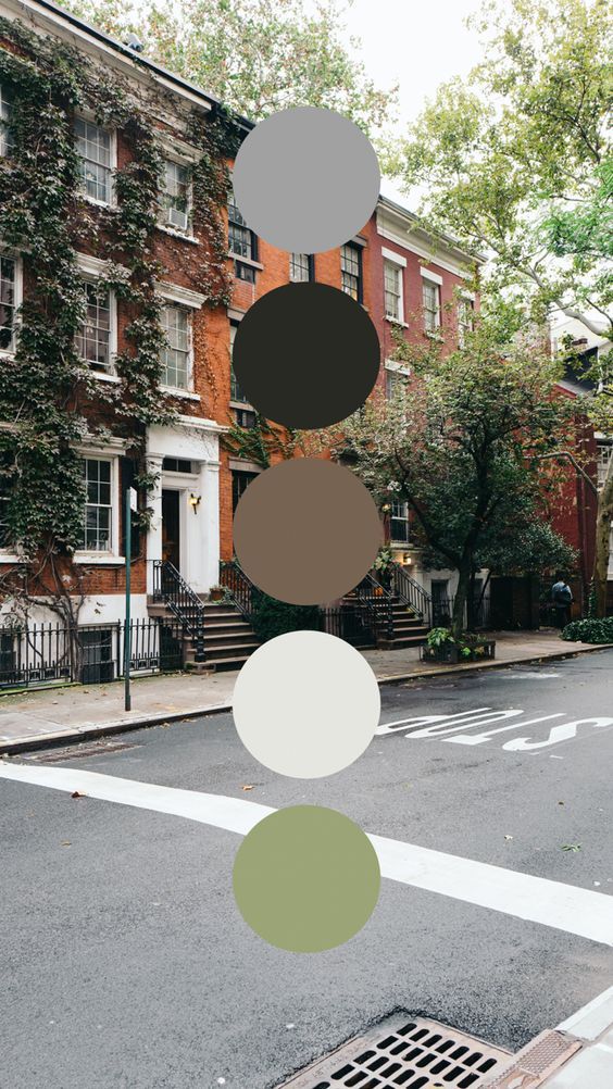
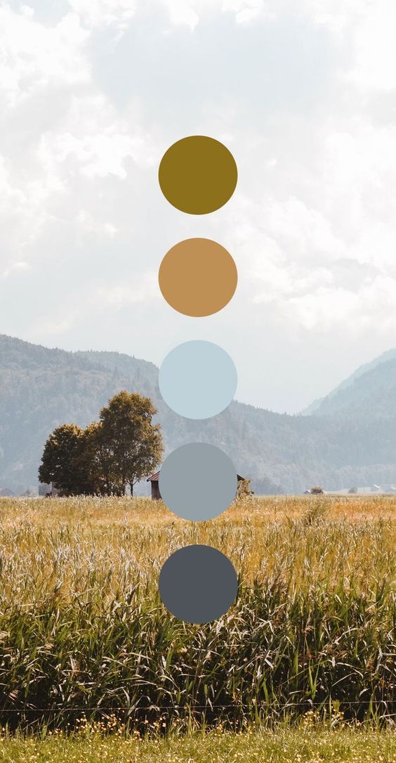
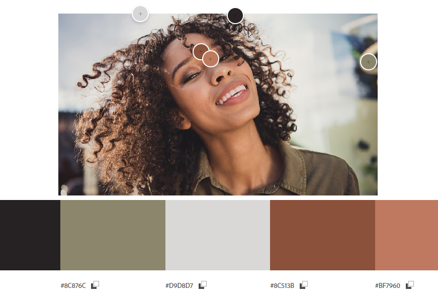
You can use websites like https://color.adobe.com/create/image to turn an image into a color palette. Use a photo of your photography setting, a picture of your favorite place, or virtually anything else. As you can see below, you can even use a picture of yourself! You can use your own natural tones to tailor an outfit that perfectly compliments your unique features.
Bold Colors and Patterns
Now I'm not saying that dramatic colors or patterns are bad. They just have to be done right! Bold colors in a photography are used to make a dramatic statement. The color takes center stage. When picking bright colors there are certain things to consider in order to pull it off. Do the colors/patterns clash with the rest of your outfit? With other's outfits? With your background? Is the color flattering to your complexation (are you an autumn wearing spring tones)? Are you using too much or opposing patterns?
You can go very bold with these themes, or you can use them as a pop to spice up an image, but there is definatley a fine balance which requires a sharp eye.
The bolder side of this style of clothing often works really well with high fashion or urban photography. Most importantly, bright colors or patterns demand confidence! Lets review some examples below:
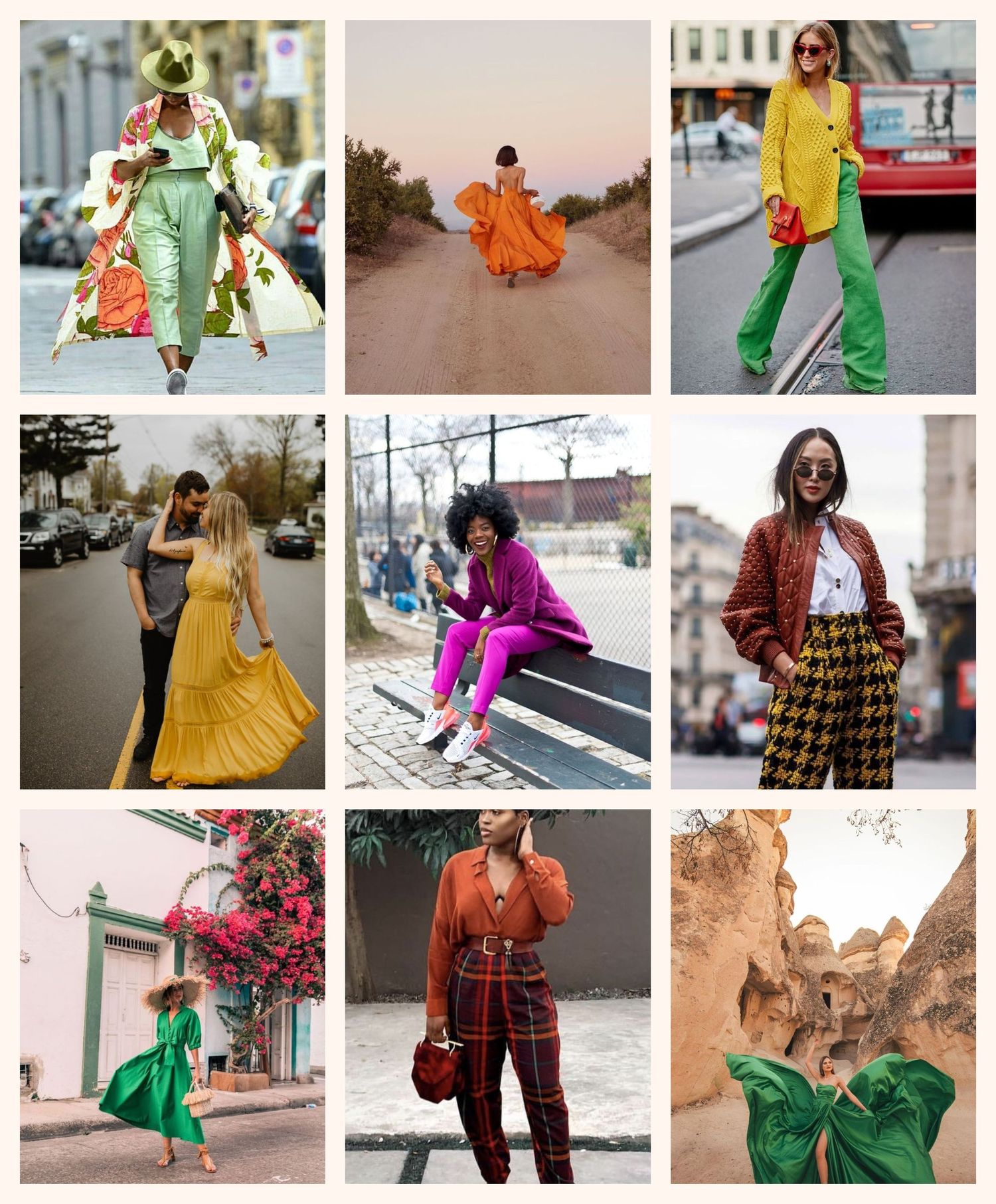
Poppin!
Bright colors and bold patterns are easiest to pull of when there are limited subjects, and you have a neutral background that draws the eye to your clothing. When there is color in the background, it helps when the colors compliment each other. When mixing a color and a pattern together, it helps when the garment's colors are in the same family of color.
Sticking to 1-2 colors and/or 1 pattern, creates a well composed image that appears tasteful and artistic.
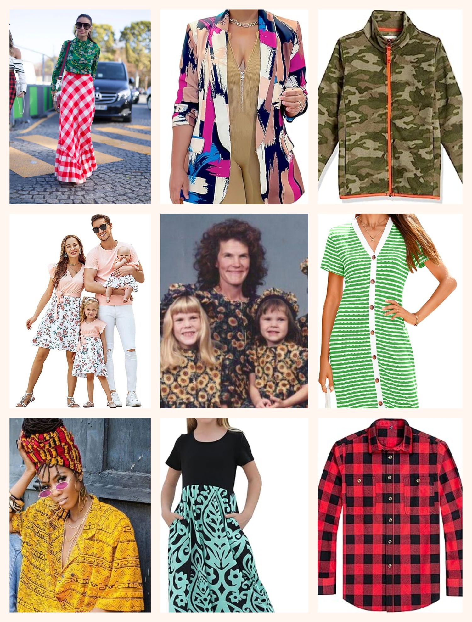
Floppin...
The biggest mistake when incorporating colors and patterns is clashing, or over-doing it. It's easy to over-use these elements, especially with multiple subjects in the photo. (This is a personal opinion, but ladies, BURN that bright red flannel your partner wants to wear in every photo!!) A little can go a long way especially in groups.
Some tips:
-Try to stick to a maximum of 2 coordinating colors for a duel-tone element.
-In groups, avoid putting everyone in the exact same color or patters.
-Try not to combine multiple patterns.
-When selecting a bright color, choose a backdrop that compliments your color scheme.
Conclusion.
Remember that the these tips are not a one-size-fits-all. These are just some basic tips that I have simplified to be less intimidating to the average person. There can always be exceptions, and maybe you're just that photogenic! Hopefully you can take some of this information today and not only apply it for your next photo session, but maybe even for your wardrobe in general.